July 27, 2022
CMG’s July Color Alert®: Despertar

Color Alert® is an exciting monthly feature from Color Marketing Group® (CMG), illuminating one color each month from CMG’s World Color Forecast™ and validating color predictions in the market.
Such a Vibrant Thing
“My future’s so bright, I need to wear shades.”
Thumbing one’s nose at the rampant negativity that is so prevalent is a powerful way to move forward. It’s leaving the past behind and moving forward in a bold fashion.
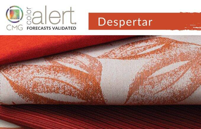
Despertar, translated as “awakening” in English, is an intense, vibrant, and highly saturated orange that is symbolic of the sun’s power and the rich life of the earth, all suggesting great growth and strength. It is a color to symbolize the awakening of future experiences, expressions, and actions in life.
It is about savoring life and soaking in all of the goodness that can be found. This is a color of the earth and heavens, one that envelops the viewer as well as entering their color experience. Warm, sultry, and intoxicating, if Despertar was a scent, it would be reminiscent of spice markets, heady with hundreds of aromas that burst with possibility and excitement.
It holds the promise and positivity of a new day and the revival of mind, body, and spirit. Emanating originally from Latin America Color Marketing Group color workshops, it is emerging in 2022 with broad reach in apparel and interior décor as well as expanding to visual communications and accessories from home to fashion. Though initially bright, it is also appearing with a slightly muted take but still with the same underlying power and energy.
Rev It Up
Used in fashion, garments get a rich, warm treatment that feels comforting and optimistic. The same hue used for accessories adds a touch of intensity and individuality as it contrasts with other hues. It gives footwear, especially casuals and sports shoes, a brawny “kick down the obstacles” vibe.
Interiors, and some exteriors (what a great entrance door color!), will continue the warming trend as Despertar adds a new layer of orangey-red to spaces. It is, after all, yellow with an overwhelming red influence, so can suggest everything from glowing stones to the hot sun. From furniture to soft upholstery, bedding to toss pillows, the intense warmth of Despertar revs up any space in which it appears.
A new take on power, promise, and positivity, Despertar stirs the senses, literally and figuratively, as a color with which to push forward.
How our interior customers are powering up with Orange
At Standard Textile, we’re seeing requests for bright oranges that bring intense energy and warmth to interiors. Despertar can be found in fabrics that elevate and add depth to a space through mixing patterns and finishes. In hospitality, customers are pairing oranges with neutrals and grays in their window treatments like drapery and solar shades and upholstery and wallcoverings in public spaces and guest rooms. In healthcare, we’re seeing pops of Despertar added to pediatric spaces through privacy curtains patterns, wallcoverings in hallways, and upholstery for seating in waiting areas. In long-term care, we are seeing window treatments such as cornice boards and drapery that bring a splash color into dining spaces and community spaces. In education, customers are incorporating custom printed solar shades and wallcoverings into public spaces for a burst of energy.
Bring the energy! Check out our fabric gallery for orange color inspiration.
Color Marketing Group® (CMG) is the premier international association for color design professionals. Their mission is creating accurate and relevant color and trend forecast information by connecting global color professionals in their shared passion. Members represent a broad spectrum of designers, marketers, color scientists, consultants, educators, and artists.
Related Content

CMG’s Key Color Alert 2021+ Color Preview: Uni-Coral
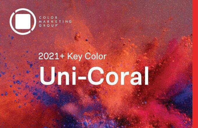
Color Marketing Group’s Asia Pacific 2021+ Key Color, Uni-Coral, is a strong hybrid of orange and red, and is the perfect color for a “pop-up” anything. Read more for to see how our customers are heating up their projects with Uni-Coral!

CMG’s Key Color Alert 2021+ Color Preview: Raison d’Etre
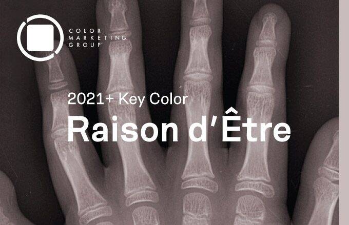
Color Marketing Group’s Europe 2021+ Key Color, Raison d’Etre, is at once earthy and slightly synthetic in appearance. It is a warm neutral with a red undertone that suggests both the natural and artificial worlds. Read more to see how our customers are balancing their spaces with this neutral color.

CMG’s July Color Alert®: Digital ID
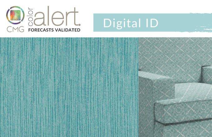
A light blue with a subtle green influence bridges consumer appetite for freshness and familiarity with yearning for new technologies and the quietness of nature. Digital ID literally and symbolically clears the air with a new age of fresh ideas, goals, and health. Check out how our customers are going Digital(ID).