February 22, 2023
CMG’s February Color Alert®: Mirada Alegre

Color Alert® is an exciting monthly feature from Color Marketing Group® (CMG), illuminating one color each month from CMG’s World Color Forecast™ and validating color predictions in the market.
New Year, New Joy
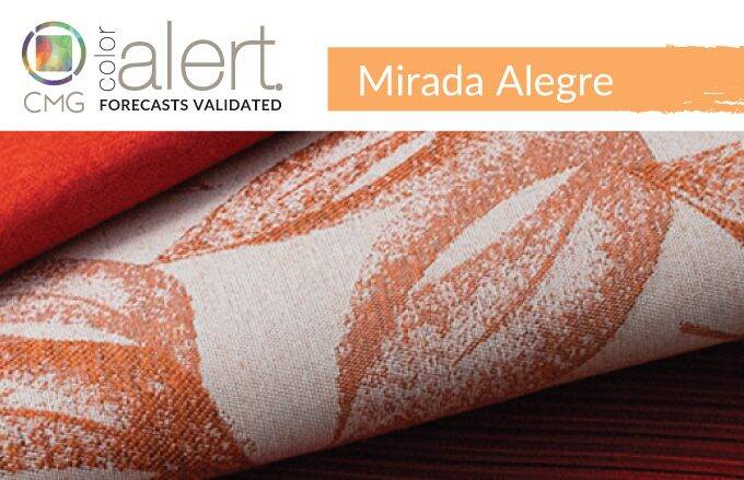
Mirada Alegre, translating to Joyful Look, is a color to celebrate rejoining the world, loved ones, and regaining joy. Emerging from Latin America Color Marketing Group color meetings for 2023, it is a medium chroma orange, almost creamy in appearance, that exudes what its moniker suggests.
The hue’s soft energy balances its yellow and red components for a sense of freshness and pleasure. Bursting with warmth from the heart, it is a hue that suggests limitless love and care instead of quick-burning passion. It embodies the joy and euphoria of once again exchanging eye contact with loved ones in person.
In addition, it has a sumptuous quality that extends it beyond joy to something to be relished and adored. Indeed, “sumptuous” is not normally a word used to describe a color this light, but the succulent look of Mirada Alegre gives it a mouth-watering appeal that is difficult to resist, and one that feels full and luscious.
Standard Textile featured fabrics: 1) Veritas in Galaxy, 2) Avalon in Horizon, 3) Gilbert in Koi, 4) Lunken in Persimmon, 5) Carew in Zest, and 6) Hyde Park in Melon
Bring the Energy
Poised to take on consumer goods, home decor and fashion, it can be used in various ways, in various products to express that “joyful look.” To create calming moods, it can be juxtaposed with soft blue tones that represent the air and water of the beach, or with quiet beiges and browns to establish tranquility and security.
Of course, joy is upbeat and to create energizing environments and products, add a high sheen and combine it with bright green to represent rebirth, or punchy shades of fuchsia or bright red to create a sharp look that expresses modernity.
No matter how it is used, Mirada Alegre will transmit feelings of color delight, and in turn, offer a truly “joyful look.”
How our Interior customers are squeezing in Orange
At Standard Textile, we’re seeing requests for this joyful orange color throughout education facilities, pediatric offices, tech spaces and more. Mirada Alegre can be found in fabrics that bring energy to spaces through mixing and contrasting or complimentary patterns and solid colors.
In hospitality, customers are adding a guestroom focal point with their window treatments with custom printed solar shades and wallcoverings featuring local landmarks in public spaces like lobbies and game rooms.
In healthcare, we are seeing orange being incorporated into playful privacy curtain designs for pediatrics. In healing spaces, such as recovery rooms and infusion centers, textiles that weave in oranges brings a sense of warmth and brightness to rooms. This can be seen with upholstered chairs, privacy curtains, or window treatments.
In education, orange is packing a punch in common areas like student unions, libraries, and lecture halls with upholstery, custom printed glassboards, and wallcoverings. In tech, custom wallcoverings bring high energy to otherwise common spaces like hallways and kitchenettes bringing a pulse to the space.
Orange you glad we have lots of options!? Check out our fabric gallery for Mirada Alegre color inspiration.
Color Marketing Group® (CMG) is the premier international association for color design professionals. Their mission is creating accurate and relevant color and trend forecast information by connecting global color professionals in their shared passion. Members represent a broad spectrum of designers, marketers, color scientists, consultants, educators, and artists.
Related Content

CMG’s Key Color Alert 2021+ Color Preview: Uni-Coral
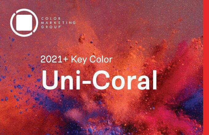
Color Marketing Group’s Asia Pacific 2021+ Key Color, Uni-Coral, is a strong hybrid of orange and red, and is the perfect color for a “pop-up” anything. Read more for to see how our customers are heating up their projects with Uni-Coral!

CMG’s Key Color Alert 2021+ Color Preview: Raison d’Etre
Color Marketing Group’s Europe 2021+ Key Color, Raison d’Etre, is at once earthy and slightly synthetic in appearance. It is a warm neutral with a red undertone that suggests both the natural and artificial worlds. Read more to see how our customers are balancing their spaces with this neutral color.

CMG’s February Color Alert®: Dream Orange and Re-Source
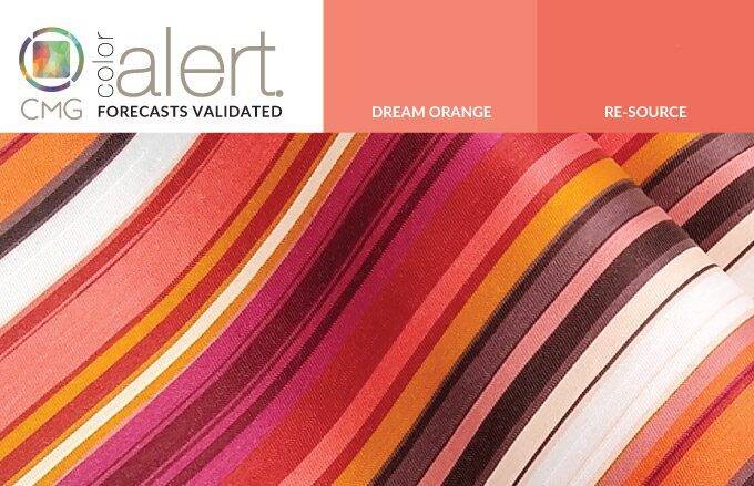
The color Orange is emerging to add a bit of spice, a bit of fun, and a bit of warmth to the world of design, all while keeping a bit of a serious note. Check out how our customers are peeling into Orange for their interiors.