February 26, 2020
2020 Pantone Color of the Year: Classic Blue & Interior Design

For over 20 years, Pantone’s Color of the Year has been an influential part of product development and purchasing decisions across a variety of industries. The color of the year is sometimes reactionary, a response to cultural movements or societal shifts that have occurred and made a noticeable impact on consumer psyche. But sometimes the color of the year is anticipatory, a color chosen to usher in a mood or perspective shift that is unknown but expected. This year the chosen color is inspired a bit by both. Something influenced in part by where society has been but speaks volumes about the hopeful path that lies ahead.
The 2020 Pantone Color of the Year is PANTONE 19-4052 Classic Blue
Suggestive of the sky at dusk—the final moment of transition between the end of the day and the beginning of a new night. A blank canvas and a relaxing hue that allows us to reflect as we prepare for the coming day. The reassuring qualities of Classic Blue highlight our desire for a dependable and stable foundation on which to build as we cross the threshold into the new decade. Laurie Pressman, Vice President of the Pantone Color Institute, told TIME magazine, “It’s a reassuring blue, full of calm and confidence. It builds connection.”
Classic Blue evokes a sense of peace and tranquility, bringing laser-like clarity and re-centering our thoughts. As the world around us continues to move at an ever-increasing pace, it can sometimes be hard to stop and take a step back to process it all. Which is why we tend to gravitate toward colors that feel honest and offer the promise of protection.
How Will Classic Blue Influence the Interiors Industry?
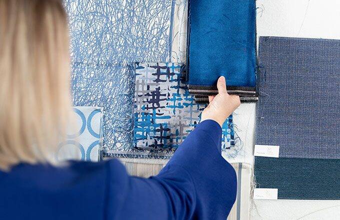
In an era when society is controlled by technology and media, Classic Blue’s timeless nature will help promote peace and stability, encouraging individuals to cleanse their minds and reclaim their focus. The Standard Textile Design Services team sees Classic Blue as a viable option across all markets. It is a perfect saturated hue that can be both safe and a focal point. Designer Kate Lake says, “Across markets, including healthcare and hospitality, crisp white walls with pops of Classic Blue will lend the eye a refreshing view, aiding concentration, and opening communication between individuals.”
We expect to see Classic Blue used in many applications across the Interiors market in the coming year, including Upholstery, Window Treatments, Top of Bed, and Privacy Curtains.
Featured Standard Textile Fabrics Inspired by Classic Blue
Lafayette in Skyline
Oslo in Lapis
Hashtag in Sapphire
Hancock in Indigo
Another Color Trend to Consider
Classic Blue isn’t the only color making an impact. According to Li Edelkoort, former president of Design Academy Eindhoven, brown is taking the color world by storm. Read more about the resurgence of brown and its impact on the hospitality and healthcare markets.
Related Content

CMG’s May Color Alert: Come Along, Alien Blue, Phygi Blue & Techno Blitz
There is nothing partisan about the new violet emerging into the design world for 2023. Check out how our Interiors customers are incorporating these four violet hues into their interiors projects.

CMG’s Key Color Alert 2021+ Color Preview: Uni-Coral
Color Marketing Group’s Asia Pacific 2021+ Key Color, Uni-Coral, is a strong hybrid of orange and red, and is the perfect color for a “pop-up” anything. Read more for to see how our customers are heating up their projects with Uni-Coral!

CMG’s Key Color Alert 2021+ Color Preview: Raison d’Etre
Color Marketing Group’s Europe 2021+ Key Color, Raison d’Etre, is at once earthy and slightly synthetic in appearance. It is a warm neutral with a red undertone that suggests both the natural and artificial worlds. Read more to see how our customers are balancing their spaces with this neutral color.