April 28, 2023
CMG’s April Color Alert: E.V.

Color Alert® is an exciting monthly feature from Color Marketing Group® (CMG), illuminating one color each month from CMG’s World Color Forecast™ and validating color predictions in the market.
Charge it Up!
Get charged with a color that feels fresh and natural, with a technological edge. Get charged with E.V.
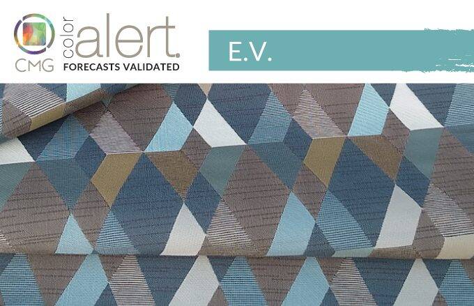
Considered ideal in high gloss, but aesthetically beautiful in any iteration, E.V. embodies the pursuit of sustainable living, especially in energy, fresh water, and air. It is a relatively low chroma, luminous-looking blue with a hint of green that adds to its cool, clean appeal.
Discussed and realized as a key color for CMG’s Asia Pacific region for 2023, but being used globally, the hue has a sense of movement that makes it especially significant in representing ongoing discussions regarding electric vehicles and new technologies for clean energy. Not surprisingly, it is anticipated for automotive interiors and exteriors and will also add an innovative appeal to color sports vehicles and equipment. Could virtual reality tennis balls glow with E.V. as they speed over the net?
Standard Textile featured fabrics: 1) Lunken in Patina, 2) Jewel in Tourmaline, 3) Nova in Seaside, 4) Bounce in Ocean, 5) Avenue in Delft, and 6) Mercury in Freeport
Vintage Vibes and Digital Design
E.V.’s arrival also coincides with the release of the newest Avatar film, which offers fantastical colors that delight and intrigue viewers in its water world. The liquidity of the color connotes a sense of wellness and renewal, and with that it will be found in health and wellness environments, as well as hospitality. From textiles to wallcoverings, furniture to accessories, E.V. will add color ease in specialty designed spaces. It is already appearing in product lines for residential living and commercial design and will provide a dynamic hue when used in visual communications and digital design.
It is a “seasonless” color that can enhance almost anything with which it is coordinated. It has a stylish take on vintage designs when used with the black of Bohld, and suggests a garden of delights with orange Mirada Alegre and cool Revival Green, with the aforementioned three hues being key colors from CMG’s other international regions.
Emerging in 2023, but with a look to the future, E.V. is a color to propel design forward as the world takes its next steps in responsible living.
How our interior customers are E.V.ing
At Standard Textile, we’re seeing requests for this wellness inspired color throughout healthcare healing spaces, lobbies and public spaces, and guest and patient rooms. E.V. colored fabrics bring a cool and calming effect to spaces through mixing bold or subtle patterns and solid contrasting colors in upholstery, wallcoverings, window treatments, and custom room décor like bedding. In hospitality, customers are adding E.V. fabrics to lobbies, public spaces, and guest rooms with upholstery, window treatments, and custom top of bed elements like throw pillows and digital printed top covers. In healthcare, healing spaces embody the E.V. color by promoting health and wellness with calming privacy curtain patterns and patterned fabrics sporting neutral colors for recliners. In hospitality, healthcare, education and tech spaces wallcoverings wrap walls in hallways, large meeting rooms, and public spaces with contemporary custom designs that exude a stress-free tranquil presence.
Ready for a fresh start? Check out our fabric gallery for Bohld color inspiration.
Color Marketing Group® (CMG) is the premier international association for color design professionals. Their mission is creating accurate and relevant color and trend forecast information by connecting global color professionals in their shared passion. Members represent a broad spectrum of designers, marketers, color scientists, consultants, educators, and artists.
Related Content

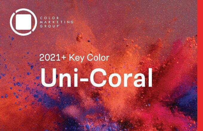
CMG’s Key Color Alert 2021+ Color Preview: Uni-Coral
Color Marketing Group’s Asia Pacific 2021+ Key Color, Uni-Coral, is a strong hybrid of orange and red, and is the perfect color for a “pop-up” anything. Read more for to see how our customers are heating up their projects with Uni-Coral!

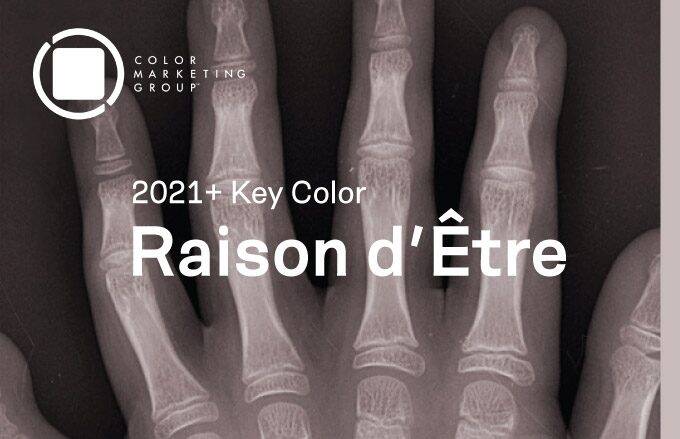
CMG’s Key Color Alert 2021+ Color Preview: Raison d’Etre
Color Marketing Group’s Europe 2021+ Key Color, Raison d’Etre, is at once earthy and slightly synthetic in appearance. It is a warm neutral with a red undertone that suggests both the natural and artificial worlds. Read more to see how our customers are balancing their spaces with this neutral color.

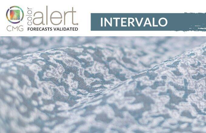
CMG’s April Color Alert®: Intervalo
A deep blue with a nuance of green, Intervalo is for those moments in between, to pause, reflect, and reset. Check out how our customers are transitioning to Intervalo for their interiors.