April 28, 2022
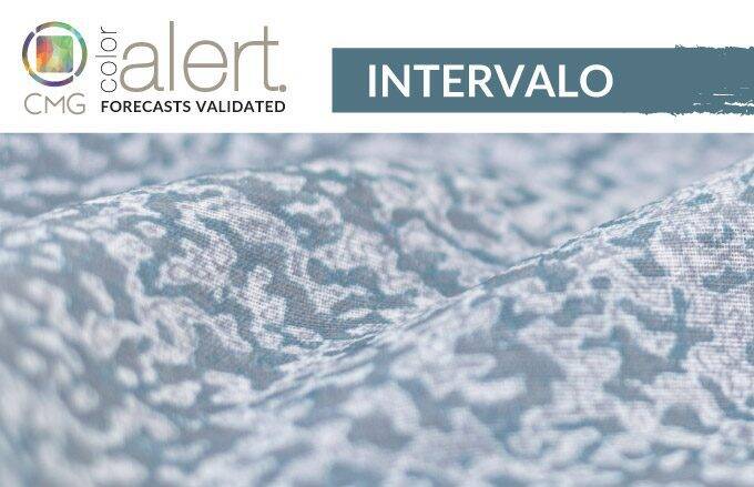
CMG’s April Color Alert®: Intervalo

Color Alert® is an exciting monthly feature from Color Marketing Group® (CMG), illuminating one color each month from CMG’s World Color Forecast™ and validating color predictions in the market.
A Bridge between Two Colors
Intervalo is for those moments in between, to pause, reflect, and reset.
A deep blue with a nuance of green, Intervalo emerged from CMG color workshops in Latin America and Europe in 2020, with anticipated arrival in 2022. Indeed, not only has it arrived in those regions, but around the globe as a color statement for the world experiencing a resetting interval.
Intervalo is neither a breathy pastel, nor a dark ponderous hue, it is a bridge color between ever popular blues and greens, but with an identity and confidence all its own. It is a hue which represents a pause, and as a transitional color secures a passage through ideas and designs from automotive to fashion to home.
Setting the Mood
For interiors, it sets a mood that is comforting and natural. It will appear as an accent color in home accessories and be a painted finish on cabinetry and appliances. It will be a hit with paint and wallcoverings as well as in tile and rugs. The color will take on a new importance in seating pieces as furnishings upholstered with Intervalo’s hue embrace their role as vessels for respite and moments of calm.
In fashion it is a color that acts as a bridge between genders and ages, a great color for anyone. It can be as formal, or casual, as the material with which it is created or the garment it adorns. It is a strong hue for athleticwear and sports equipment or, with the return of “revenge dressing,” looks elegant for times when dressing up is desired. Intervalo can move from the gym to restaurant with ease, flowing between scenes as it flows through the intervals of the day.
Standard Textile featured fabrics: 1) Niles in Scuba, 2) Digby in Peacock, 3) Quell in Peacock, 4) Berserk in Ocean, and 5) Piedmont in Peacock
Mixed hues
Intervalo is often mixed with other hues and it appears quite seductive when enhanced with special effects. It takes on a mineral dimension that few others can imitate. Whether in personal electronics, handbags, or jewelry, it is a brilliant ground color for multi-hued effects. For the world of interiors (and exteriors) it increases its style quotient with a mix of sheen levels from matte to high gloss.
Each day is filled WITH resets and transitions and Intervalo makes the transitions smooth and immensely colorful.
How our interior customers are transitioning to Intervalo
At Standard Textile, we’re seeing requests for a range of deep blue green fabrics that bring intensity to interiors. Intervalo can be found in fabrics that bring dimension and drama to a space through mixing sheens, patterns, and similar hues. In hospitality, customers are pairing deep blue green with neutrals and grays in their window treatments like drapery and custom printed solar shades, and wallcoverings for public spaces and guest rooms. In education, customers are incorporating upholstery and wallcoverings into student collaboration areas and student unions. In healthcare , were seeing Intervalo’s warmth and comforting color added to patient rooms through privacy curtains, furnishings like chairs and stools, as well as blankets. In long-term care, we are seeing residential inspired bedding in deep blues with greens to add a touch of home to resident’s rooms.
Stay calm and Intervalo on! Check out our fabric gallery for yellow color inspiration for your next project.
Color Marketing Group® (CMG) is the premier international association for color design professionals. Their mission is creating accurate and relevant color and trend forecast information by connecting global color professionals in their shared passion. Members represent a broad spectrum of designers, marketers, color scientists, consultants, educators, and artists.
Related Content

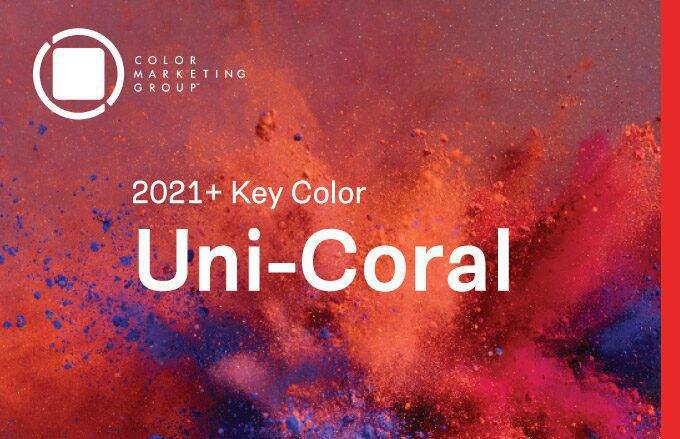
CMG’s Key Color Alert 2021+ Color Preview: Uni-Coral
Color Marketing Group’s Asia Pacific 2021+ Key Color, Uni-Coral, is a strong hybrid of orange and red, and is the perfect color for a “pop-up” anything. Read more for to see how our customers are heating up their projects with Uni-Coral!

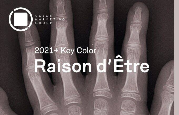
CMG’s Key Color Alert 2021+ Color Preview: Raison d’Etre
Color Marketing Group’s Europe 2021+ Key Color, Raison d’Etre, is at once earthy and slightly synthetic in appearance. It is a warm neutral with a red undertone that suggests both the natural and artificial worlds. Read more to see how our customers are balancing their spaces with this neutral color.

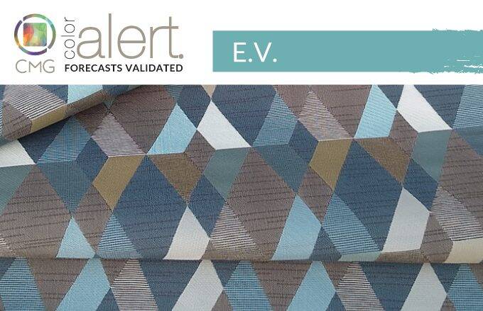
CMG’s April Color Alert: E.V.
E.V. embodies the pursuit of sustainable living, especially in energy, fresh water, and air. It is a relatively low chroma, luminous-looking blue with a hint of green that adds to its cool, clean appeal. Check out how our Interiors customers are incorporating E.V. into their interiors projects.