August 25, 2022
CMG’s August Color Alert®: Fronda

Color Alert® is an exciting monthly feature from Color Marketing Group® (CMG), illuminating one color each month from CMG’s World Color Forecast™ and validating color predictions in the market.
Look at the Greener Side of Life
The most recognized color of nature, eco-consciousness, sustainability, and the planet, green holds its own as a symbol of growth and life. Kermit the Frog, singing “It ain’t easy being green,” realized ultimately, that it’s beneficial, fun, and easy being green.
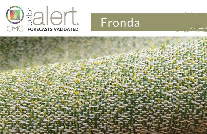
A toned yellow-influenced green, Fronda is a symbol of creativity in nature, the eco-system, and bio-science. Discussions of nature and eco-awareness, and the colour inspiration are ongoing for design applications, especially home and office. The focus has become more fine-tuned, though, as Fronda represents nature’s energy as the world moves on a path of renewal, even during times of planetary distress.
Fronda is a colour of transformation and international in scope. Having emerged from discussions in CMG Latin America meetings in 2020, to emerge this year, it has quickly become a global colour messenger to connect nature and the design world with its natural hue.
Standard Textile featured fabrics: 1) Homage in Sage, 2) Cambridge in Pterodactyl, 3) Zircon in Rosemary, 4) Westwood in Moss, and 5) Milton in Fern
Think Green, Look Serene
As a hue that can, seemingly, be internalized and healthy, Fronda is reminiscent of a smoothie’s liquid benefits and is a soothing hue for interiors. It is a bridge to the world outside, ever-changing and growing. From a simple toss pillow to painted walls, introducing this colour as an accent or as a full on colour statement works to create inviting environments.
It bathes spaces with calm and can take on many guises with the likes of different finishes and textures, often combined into one colour aesthetic. Matte texture is lush and connotes cozy softness in velvet or, conversely, is crisp and daring in high gloss metal or paint. Touches of Fronda scattered as seating in residential or commercial space can mimic lily pads floating on the water. Of course, underfoot in carpeting, tile, or stained wood, the color becomes an inviting lush lawn that visually cools a space and suggests a frolicsome outdoor space.
Though extremely important for architectural interior and exterior environments, Fronda, in variations, is also appearing in fashion. It is an excellent colour with which to move through the urban world, whether wrapped in a dress, coat, or slacks, or toted as an accessory. It is a genderless colour that appeals to all for its natural vibe, and easy to coordinate nature. Watch for versions of green jade to appear in jewelry, and a bit of patinaed copper to carry the colour further forward and make it a larger part of fashion’s colour conversation.
Green is ever-present and Fronda represents a new direction for its energizing nature and represents health and transformation. Take it all in, enjoy it, because it’s easy being green.
How our interior customers are going Green
How our interior customers are going Green
At Standard Textile, we’re seeing requests for earthy greens that bring a soothing atmosphere to interiors. Fronda can be found in fabrics that bring a nature, inspired hue that adds warmth and dimension to spaces through mixing patterns and finishes. Biophilia patterns found in fabrics and custom printed decor bring Fronda’s spectrum of greens into a variety of spaces. In hospitality, customers are pairing greens with blues and grays in their décor through their window treatments like drapery and upholstery public spaces and guest rooms. In healthcare, we’re seeing Fronda added to lobby spaces and patient rooms with upholstery for seating. In long-term care, we are seeing window treatments such as cornice boards and drapery, as well as bedding that bring an healing, serene feel into resident rooms and community spaces.
Time to explore the world of green! Check out our fabric gallery for green color inspiration.
Color Marketing Group® (CMG) is the premier international association for color design professionals. Their mission is creating accurate and relevant color and trend forecast information by connecting global color professionals in their shared passion. Members represent a broad spectrum of designers, marketers, color scientists, consultants, educators, and artists.
Related Content

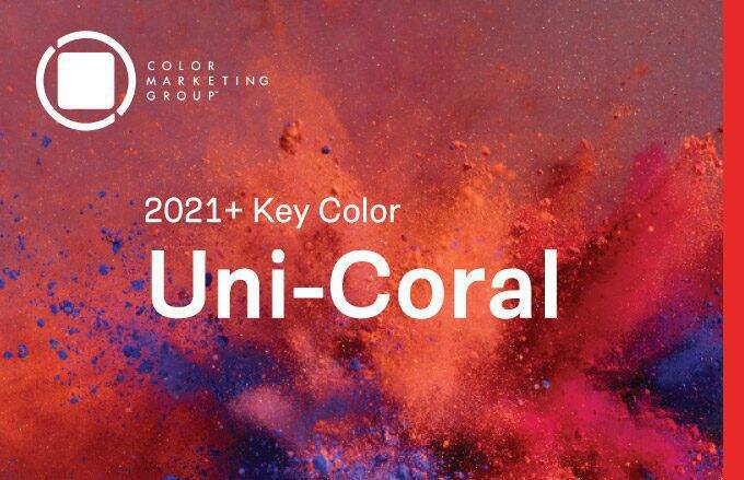
CMG’s Key Color Alert 2021+ Color Preview: Uni-Coral
Color Marketing Group’s Asia Pacific 2021+ Key Color, Uni-Coral, is a strong hybrid of orange and red, and is the perfect color for a “pop-up” anything. Read more for to see how our customers are heating up their projects with Uni-Coral!

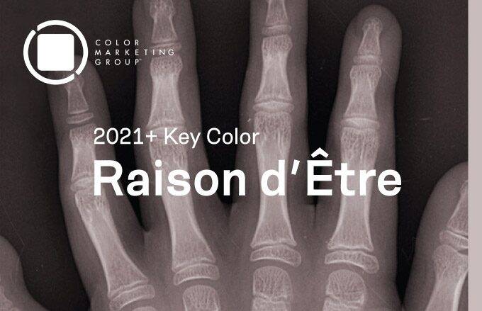
CMG’s Key Color Alert 2021+ Color Preview: Raison d’Etre
Color Marketing Group’s Europe 2021+ Key Color, Raison d’Etre, is at once earthy and slightly synthetic in appearance. It is a warm neutral with a red undertone that suggests both the natural and artificial worlds. Read more to see how our customers are balancing their spaces with this neutral color.

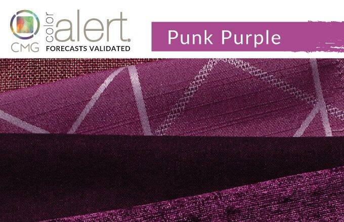
CMG’s June Color Alert®: Punk Purple
Punk Purple simply has a commanding presence and plays very well with other hues. Check out how our interior customers are going Punk with Purple!