December 21, 2021
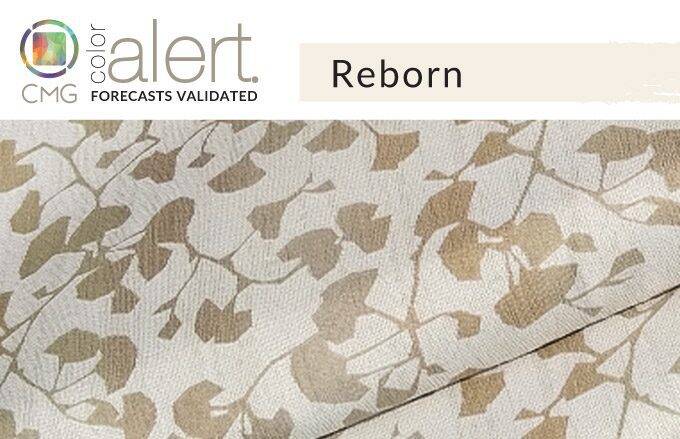
CMG’s December Color Alert®: Reborn

Color Alert® is an exciting monthly feature from Color Marketing Group® (CMG), illuminating one color each month from CMG’s World Color Forecast™ and validating color predictions in the market.
The Brightest Light
It’s a blank canvas, a fresh start, the absence of color, the brightest light, the ultimate chakra. Take your pick at what it may personally represent, it’s all white. Emerging from CMG European meetings in 2019, with expectations to appear in 2022, it has come roaring into place and is not held solely by the continent. The aptly named Reborn has global aspirations and acceptance to wipe the slate clean of the past couple of years and embrace the new.
As simple and refined as it may seem, It does get a subtle hint of color with a slightly creamy glow that gives it a sense of inner light. The hint is just enough to add an underlying interest, but still keeps a sense of an easy, pure hue. With a knowing wink, the essence of Reborn may have a few iterations of its value and nuance, but in the end, it is still white.
Standard Textile fabrics featured: 1) Recliner in Homage/Winter, 2) Fabric detail in Sparkle/Rose Gold, 3) Fabric detail in Venice/Coconut, 4) Fabric detail in Westwood/Dove, and 5) Fabric detail in Melbourne/Pearl
Light + Contrast
As a mixer in design, it is as useful as water in a cocktail. It can sharpen a space, surely, but also act as a catalyst for colors that need a bit of balance and a rest for the eye. In nature, white is a connector. The floating clouds and wave crests flow around the world, the former changing as they drift with the winds and the latter seeming to move from one shoreline to the next.
“But there is always white.” True, but it is not always a Zeitgeist capturing color. Now, it is. In fashion, it is a rebel to be worn irrespective of the season. It adds a punch and high contrast to dark colors in a way usually reserved for high-chroma hues. It can stand on its own or be a catalyst to make everything else look more alive. It has an “in your face” attitude as white is used as a punctuation point in accessories, often in seasons around the world that used to eschew white except for summer wear.
Interiors are also getting a boost from this non-neutral neutral. The nuanced warmth makes for comfortable spaces that helps embrace the general warming trend of interior hues. Working with everything from navy and dark green, to cocoa, red, and black, it was once a standard color, but now one exudes a new life. It even works with a variety of greys to raise their relevance and make them appear fresh. Reborn is a companion, a mixer, and a stand-alone statement. It is a way to move from one year to the next, in season-less color style.
How our Interiors customers are embracing Reborn
At Standard Textile, we’re seeing requests for white and creamy colored fabrics that bring in a lightness or softness to interiors. In hospitality, customers are pairing Reborn’s blissful creamy hue into window treatments like solar shades and sheers, and top of bed décor like top covers and pillows. In education, customers are incorporating into window treatments for resident halls, student unions, and classrooms. Fabrics like sheers and decorative shadecloths that include neutral, off-white hues add a lightness to a room, breaking up bold furnishing and wall colors. Subtle patterns and textured fabrics are just some ways our customers are incorporating Reborn neutral colors into their spaces.
In healthcare and long-term care facilities, we’re seeing Reborn cream and white colors used for window treatments, like sheer decorative shadecloth and solar shades. These light reducing and defusing shades are seen in corridors, patient rooms, and lobbies.
Let the light in! Check out our fabric gallery for Reborn color inspiration for your next project.
Color Marketing Group® (CMG) is the premier international association for color design professionals. Their mission is creating accurate and relevant color and trend forecast information by connecting global color professionals in their shared passion. Members represent a broad spectrum of designers, marketers, color scientists, consultants, educators, and artists.
Related Content

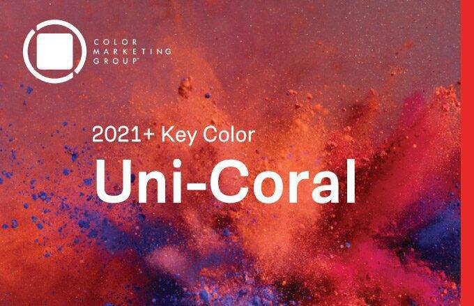
CMG’s Key Color Alert 2021+ Color Preview: Uni-Coral
Color Marketing Group’s Asia Pacific 2021+ Key Color, Uni-Coral, is a strong hybrid of orange and red, and is the perfect color for a “pop-up” anything. Read more for to see how our customers are heating up their projects with Uni-Coral!

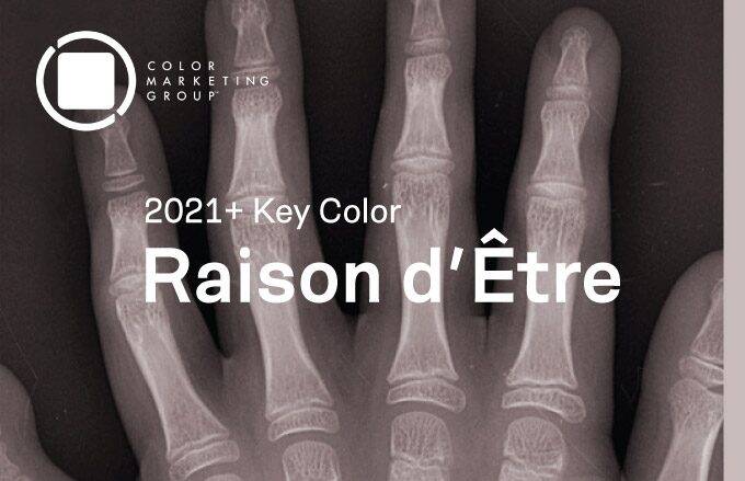
CMG’s Key Color Alert 2021+ Color Preview: Raison d’Etre
Color Marketing Group’s Europe 2021+ Key Color, Raison d’Etre, is at once earthy and slightly synthetic in appearance. It is a warm neutral with a red undertone that suggests both the natural and artificial worlds. Read more to see how our customers are balancing their spaces with this neutral color.

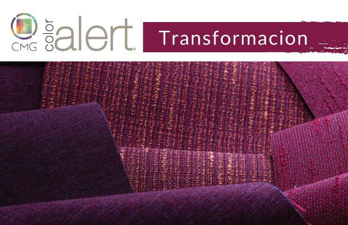
CMG’s December Color Alert®: Transformacion
Representing the evolution of life cycles from birth through youth, adulthood, and finally mature years, Transformacion, a deep hue that is red with an influence of blue. The depth of the color is welcoming and warming, the subtle color play between red and blue is contemplative, and the name, well, it is fitting for the…