September 30, 2020
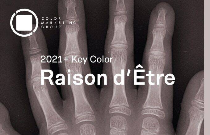
CMG’s Key Color Alert 2021+ Color Preview: Raison d’Etre

Color Alert® is an exciting monthly feature from Color Marketing Group® (CMG), illuminating one color each month from CMG’s World Color Forecast™ and validating our color predictions in the market.
Raison d’Etre is at once earthy and slightly synthetic in appearance. It is a warm neutral with a red undertone that suggests both the natural and artificial worlds. Determined by color experts at CMG’s European meetings in 2019 as a key color for emergence in 2021+, Raison d’Etre is the connection between nature and the built environment, that the entire planet is home and needs endless respect. Raison d’Etre is a color of balance to add comfort and a sense of reason.
Standard Textile fabrics featured: 1) Avalon in Driftwood, 2) Nova in Putty, 3) Citadel in Platinum, 4) Flash in Canvas, and 5) Regina in Mica
Zen out with greys
Raison d’Etre will be emerge across all industries, with significance placed on special effects, finishes, and textures. The fluctuation in effects adds to the neutralized nature of the color and creates a perfect utilization of this neutral in transportation, fashion, and home décor. The sophisticated depth of Raison d’Etre proposes the urgency for practicality in a one-dimensional and fast-moving world with developing global events that continue shifting everyday lives.
For home interiors, the varying greys of Raison d’Etre will be seen in both matte and gloss finishes. Textiles and furnishings will deliver harmony and lavishness to various spaces in a multitude of textures and finishes, especially through the use of metallics like gold and silver.
For contract interiors, the varying greys of Raison d’Etre will be seen in in transitional warm and cool tones in a multitude textures and finishes. Textiles and furnishings will delivery harmony and create a clean foundation for smart design.
Standard Textile fabrics featured: 1) Bosca in Oyster, 2) Lunken in Mushroom, 3) Pivot in Gravel, and 4) Rock on Celebrity in Putty
How our customers are balancing their interior projects with Raison d’Etre
At Standard Textile, we’re seeing requests for custom bed surrounds, window treatments, such as drapery and solar shades, and neutral fabrics that can be utilized in a variety of spaces. In hospitality, customers are taking advantage of warm greys, subtle geometric designs, sheer fabrics, and metallic finishes.
The mixing of nature inspired patterns and earthen tones with our custom printed design solutions, create a dramatic and dynamic atmosphere that is unique to our customers’ project. Raison d’Etre creates a peaceful, calm visual oasis in an otherwise busy world. These grey hues lend themselves to create a yin and yang of cool and sophisticated, or tranquil and soothing atmosphere. Raison d’Etre colorways can be found in fabric patterns for privacy curtains, upholstery fabric, bedding, and window treatments in our healthcare interior applications.
Raison d’Etre is even making an appearance in Standard Textile Home, our collection of bedroom and bath essentials made for the finest hotels, now available to the public. The Luxe Reversible Duvet neutral bedding will add a warmth and balance to your bedroom making it a relaxing getaway from the hustle and bustle of the day. The Reversible, two-tone duvet cover offers twice the style, all while being made with 100% environmentally friendly BCI-certified cotton.
Sit back, relax, and unwind! Check out our fabric gallery for Raison d’Etre color inspiration.
Color Marketing Group® (CMG) is the premier international association for color design professionals. Their mission is creating accurate and relevant color and trend forecast information by connecting global color professionals in their shared passion. Members represent a broad spectrum of designers, marketers, color scientists, consultants, educators, and artists.
About Color Marketing Group’s World Color Forecast™
Color Marketing Group’s multi-industry color design professionals collaborate globally to arrive at their forward-looking color palette of 64 colors. These forecasted colors are supported by color stories that contain each color’s drivers and influences two years ahead. Each of the four global regions identifies their Key Color from their 16 forecasted colors. Product designers across all industries have been influenced by Color Marketing Group’s World Color Forecast for over 57 years.
Related Content

CMG’s Key Color Alert 2021+ Color Preview: Uni-Coral
Color Marketing Group’s Asia Pacific 2021+ Key Color, Uni-Coral, is a strong hybrid of orange and red, and is the perfect color for a “pop-up” anything. Read more for to see how our customers are heating up their projects with Uni-Coral!

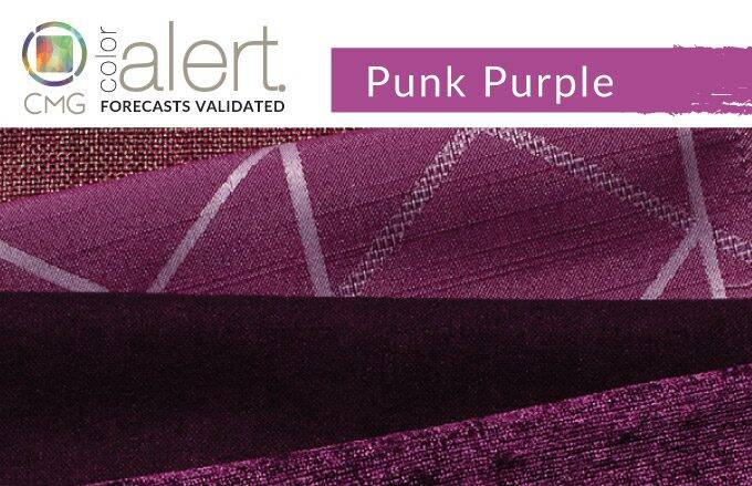
CMG’s June Color Alert®: Punk Purple
Punk Purple simply has a commanding presence and plays very well with other hues. Check out how our interior customers are going Punk with Purple!

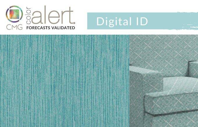
CMG’s July Color Alert®: Digital ID
A light blue with a subtle green influence bridges consumer appetite for freshness and familiarity with yearning for new technologies and the quietness of nature. Digital ID literally and symbolically clears the air with a new age of fresh ideas, goals, and health. Check out how our customers are going Digital(ID).